West Michigan Graphic Design Archives Website
The Client
The West Michigan Graphic Design Archives (WMGDA) is a physical archive of influential graphic design made in—and for—West Michigan. Their website allows users to virtually browse the artifacts, schedule a visit, submit projects and information, and learn more.
Values
Preservation:
Honoring and preserving the legacy of influential Michigan designers and industries.
Education:
Providing a valuable resource for design students, educators, researchers, and practitioners to learn and be inspired by.
Appreciation:
Helping people appreciate how design has helped successful businesses achieve their goals.
Users

Design Educator
"I want my students to see excellent examples of design that don't feel distant."

Design Student
"My projects should be inspired by truly exemplary design work, not the first several Google results."

Design Professional
"Design is a community based art form: I love seeing what my colleagues have been up to, and it always feels good to share my work."

Archivist
"The rich history and contributions of graphic design in our region deserve to be appreciated and remembered."
The Collaboration
I worked on this project collaboratively with Charles Reister, a fellow student in the Design Project Center. We both did a little of everything, but I focused more on sketching, concepting, client communication, and identifying website anomolies.
Charles worked with me on concepting, but focused most heavily on coding and on the final Figma prototypes.
Charles Reister DesignFavorites
Problems to Solve
- Small favoriting hotspot.
- Unclear & inconsistent iconography.
- Clashing colors.
Early Ideation
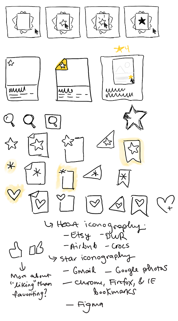
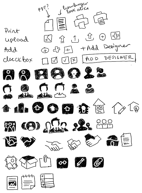
Considering different iconography systems.
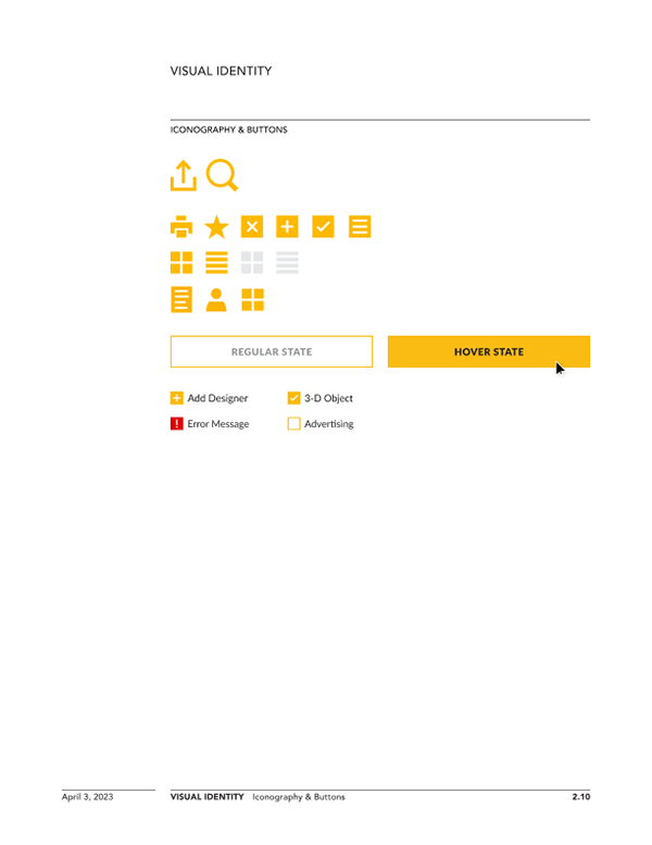
Final Iconography

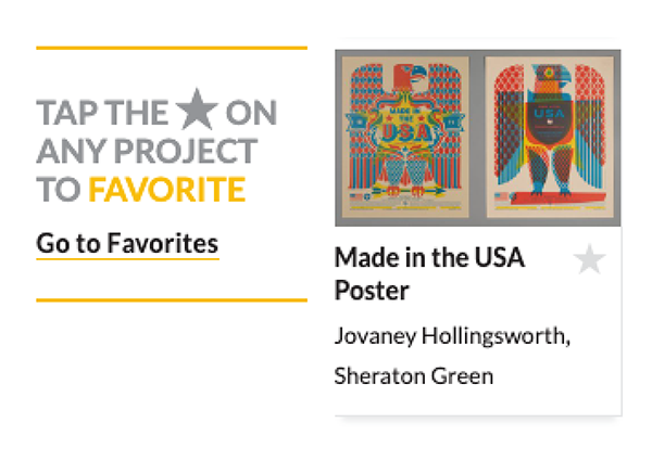
Static Instruction
Creating a brief instructional and a method for mobile where there aren't hover states.
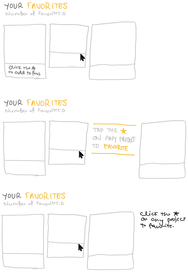
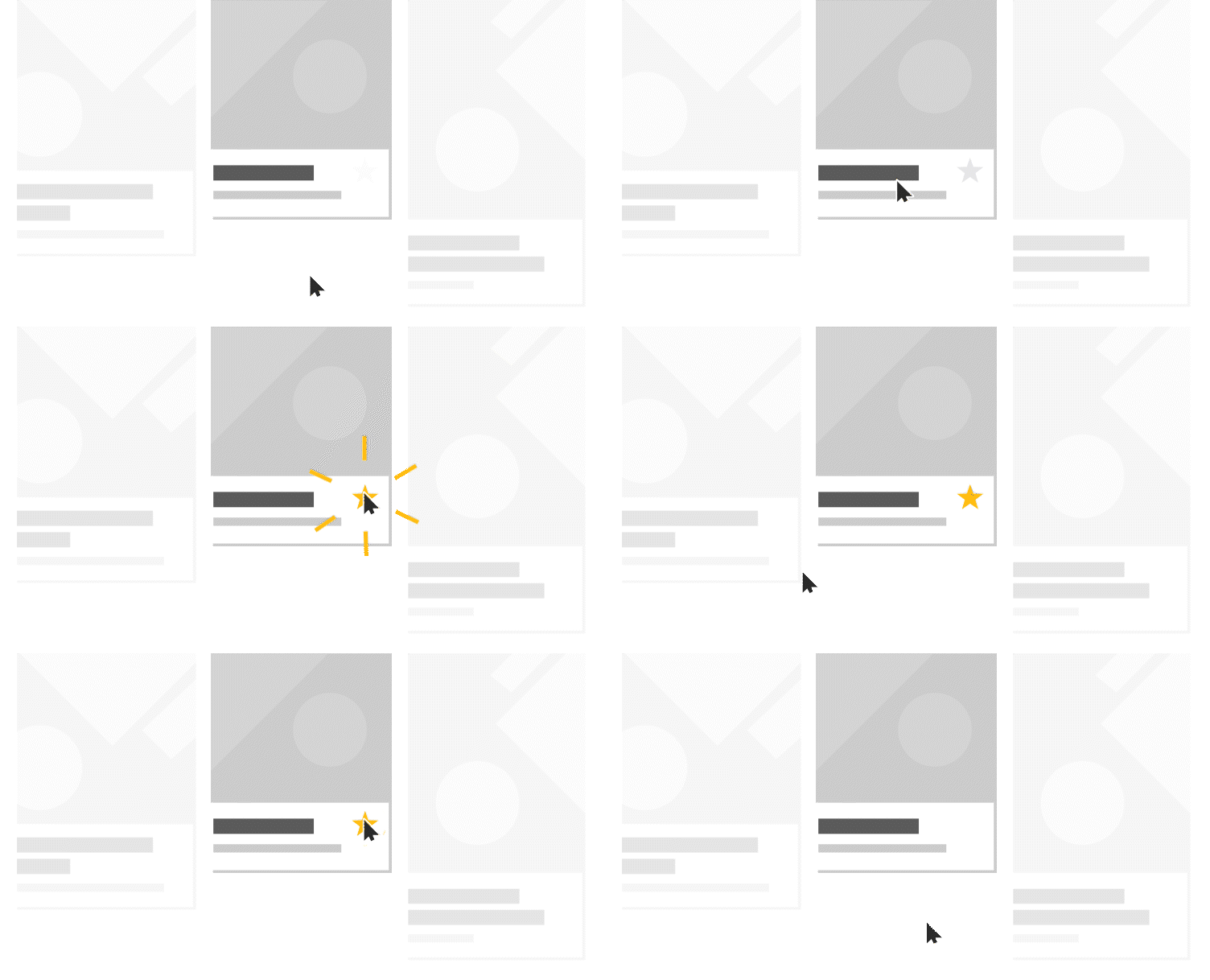
Instructional Animation
When no favorites are selected, the favorites page becomes an instructional.
Iconography
The Challenge
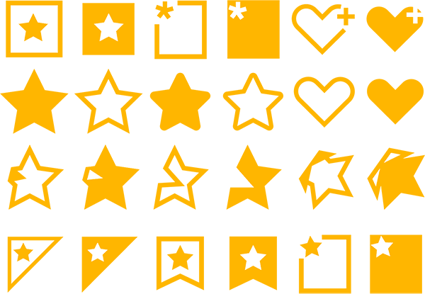
Creating a unified set of icons to be used across the site.
Concepting
Sketches and digital versions of icon directions were tested and helped inform the final decision.

Updating the System
Including the changes in the Big Book.
Type Style Unification
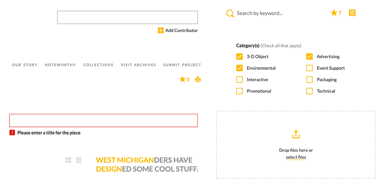
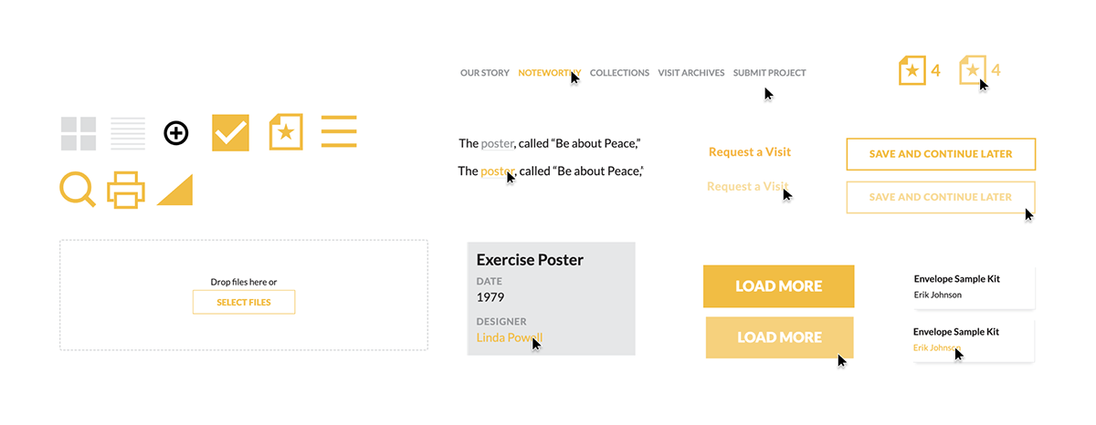
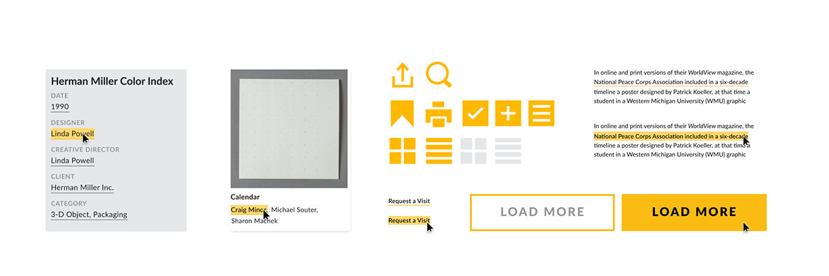
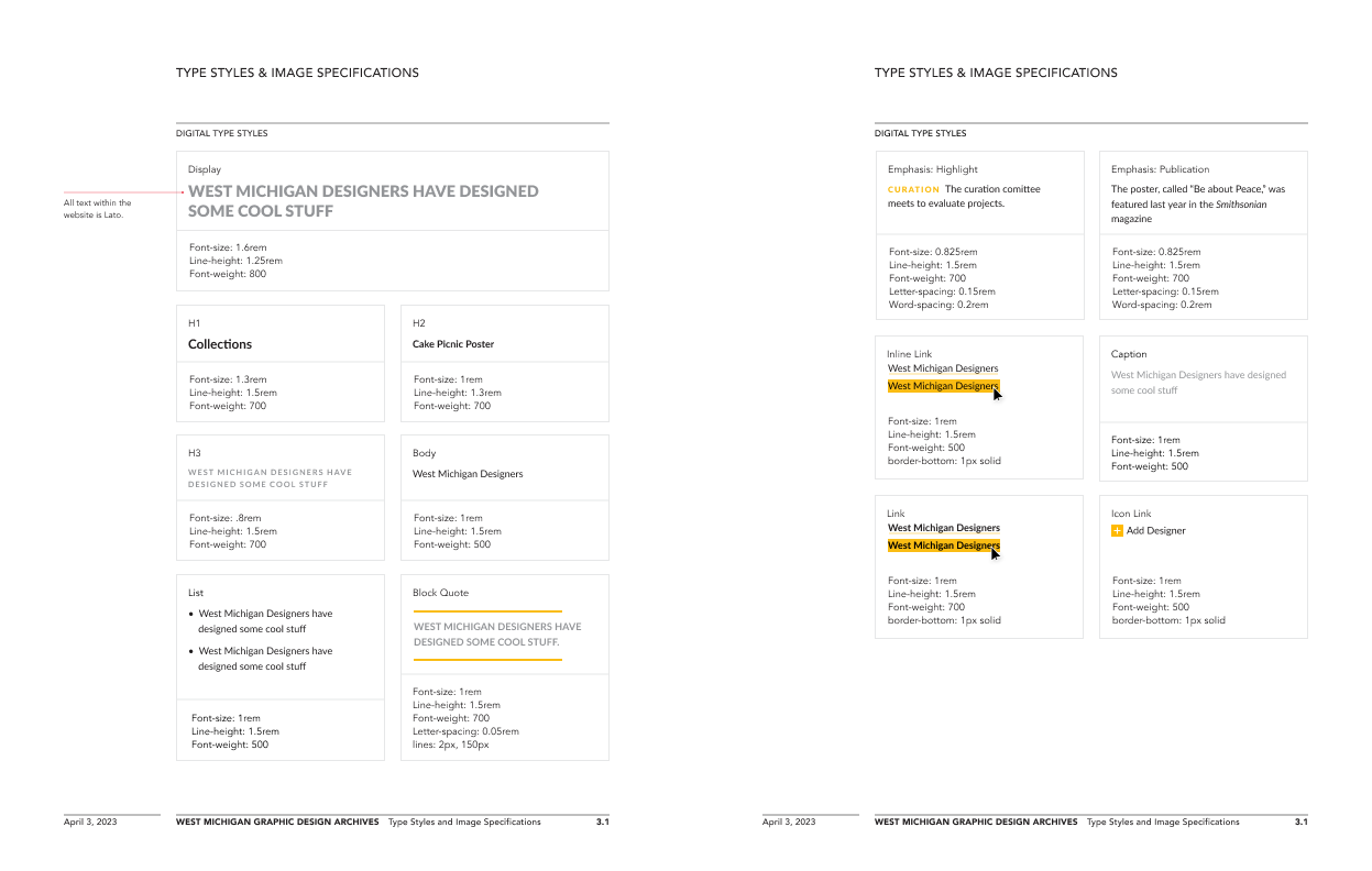
Throughout the website typestyles were not unified. Charles and I defined consistent type solutions and implemented them into the website.
The Audit
We determined where styles were inconsistent.
The Result
Navigation
A new navigation strategy reccommendation was prototyped and proposed.
Problems to Solve
- Three layers of information take up a large amount of space and pull focus from the projects.
- Three different typestyles create conflict.
- A large, complicated drop down menu makes navigation confusing.
Best Practices Audit
I compiled a list of best practices to learn from other archival websites.

Consideration 1: Vertical Menu
To collapse the nav, we considered including a single horizontal menu and a single vertical menu.
Full Screen Flow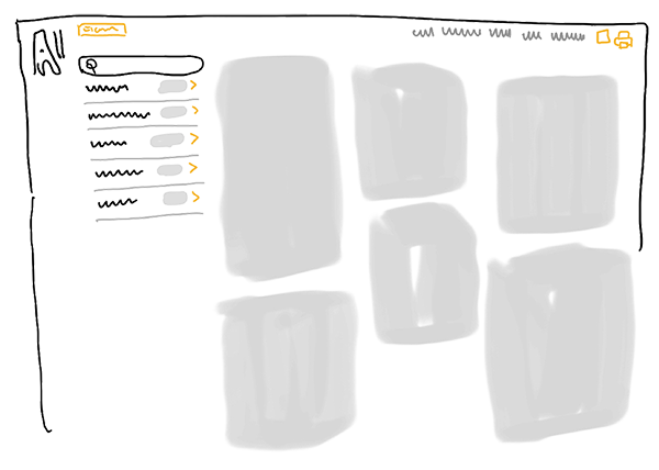
Consideration 2: Indexes
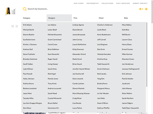
Rather than a drop down menu, "Designer", "Firms," and "Clients" could take the user to a new page type that functions as an index.
Full Screen Flow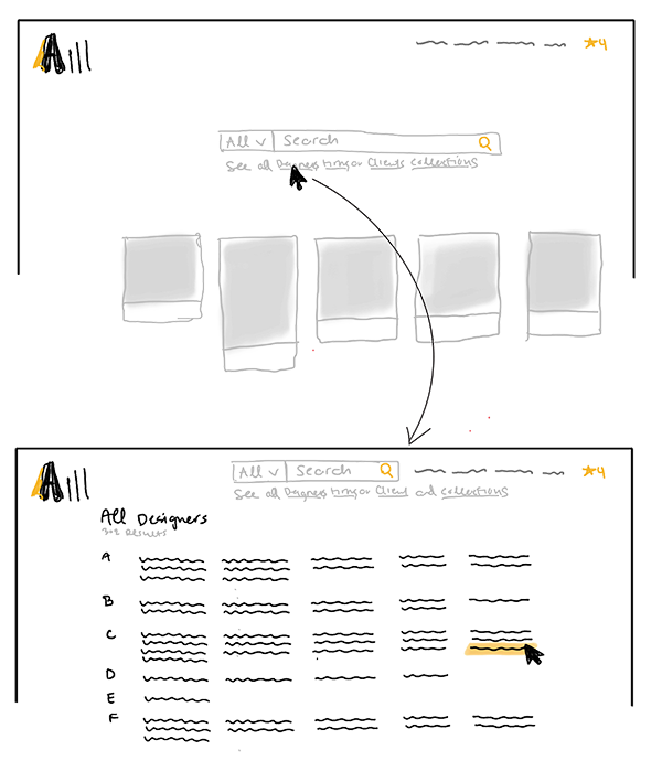
Consideration 3: Word Cloud Menu
We contemplated having dedicated pages structured like word clouds.
Full Screen Flow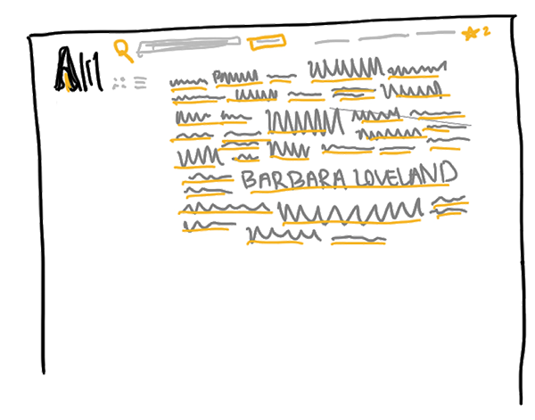
Consideration 4: Tag System
I explored the idea of switching the system over to being entirely made up of tags. This would allow the user to filter by multiple categories at the same time.
Full Screen Flow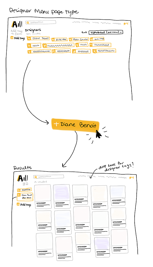
Final Direction
Charles and I prototyped and pitched these final directions in Figma.
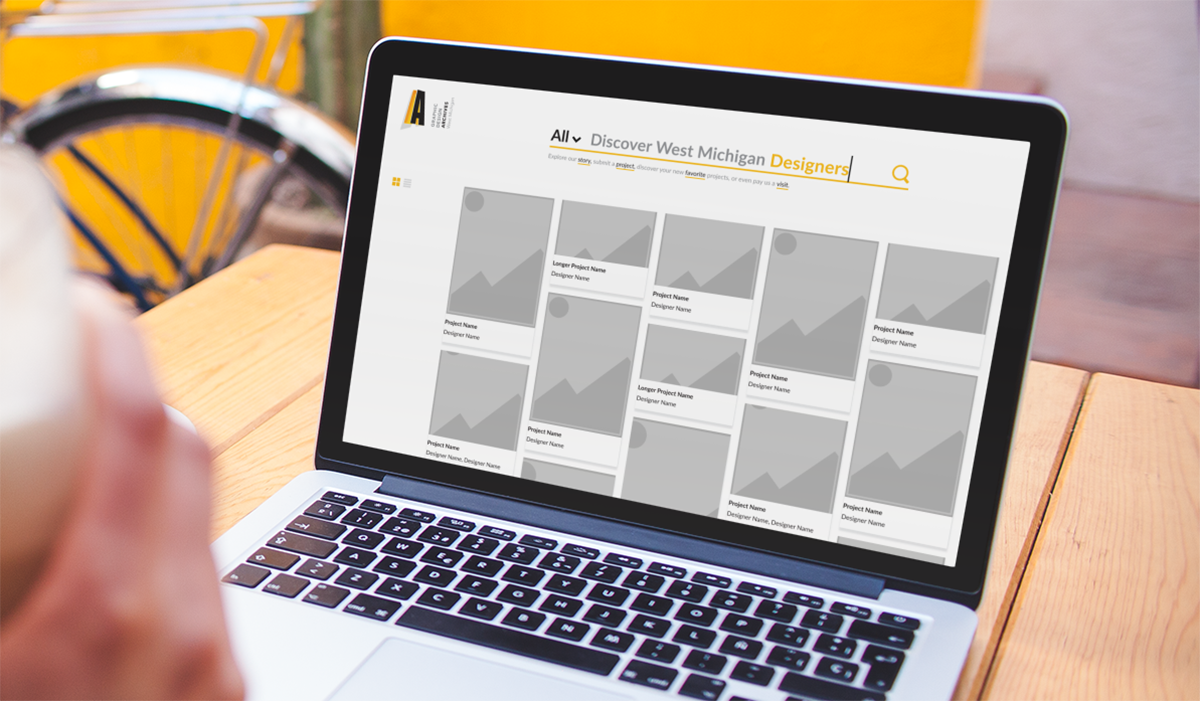
Animated Home Screen
Animation and scale places emphasis on the search field.
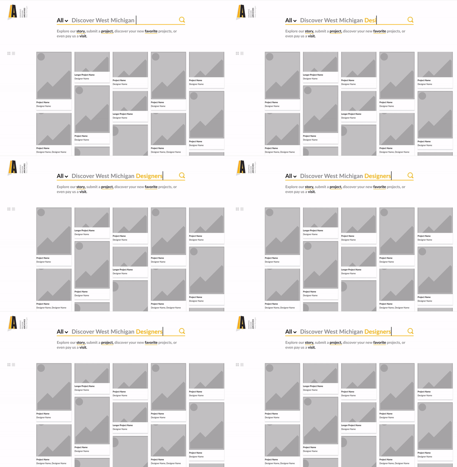
Navigation
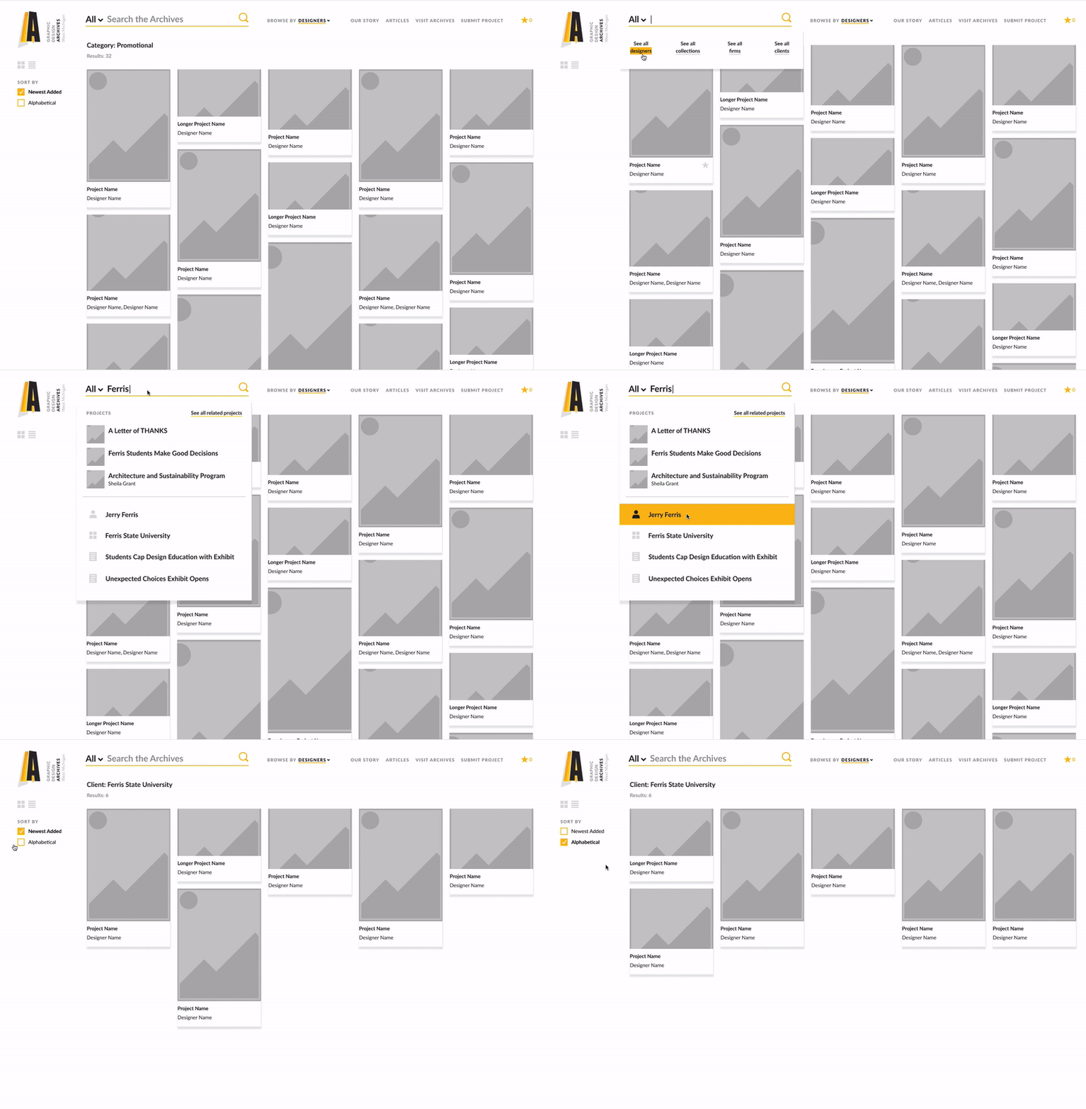
The navigation on scroll and sub-level page types is simplified and prioritizes search funtionality.

Indexes
Indexes are searchable from the search pop up menu, or the primary navigation.
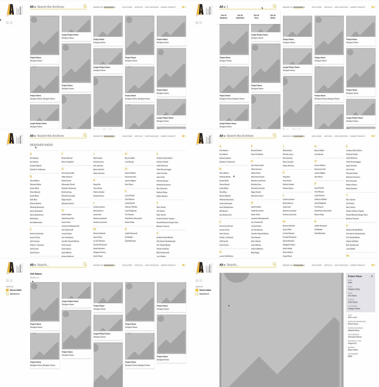
Drop Down Menu & Sort
A drop down menu makes it easy to search for projects, designers, firms, and clients. A sort menu makes it simple to search through the results.
