Uniche
The Challenge
Branding a financial advising organization tailored specifically to creative freelancers.
Values
Comfort:
Clients need to trust and be comfortable with their financial advisor.
Teaching:
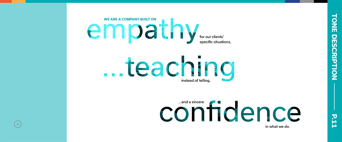
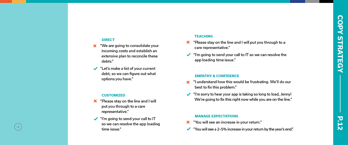
Advisors should educate clients so they can make choices for themselves, instead of telling them what to do.
Simplicity:
A good financial advisor helps more options feel good, not overwhelming.
Interview

Bill Peterson
President of Better Benefits
I had the opportunity to interview Bill and ask about what freelancers need in a Financial Advisor. As both a Financial advisor and a freelancer himself, Bill provided a lot of extremely helpful insight.
"I meet people in their homes because everyone communicates, but few people connect. That sets me apart."
"Freelancers in particular want to be taught, not told. They want to feel equipped to make their own decisions."
"In financial advising, it's critically important to ask a lot of questions."
Building the Brand
Early Ideation
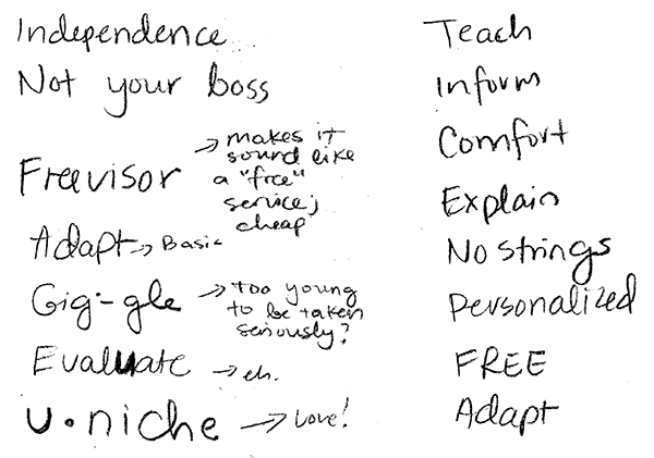
A comprehensive brainstorm yielded many potential naming solutions, and countless sketches. Pictured here are some of the front runners.


Typeface
I chose Usual for it's simplicity. Financial advising seems complex; Uniche's job is to make it easier.

Color Palette
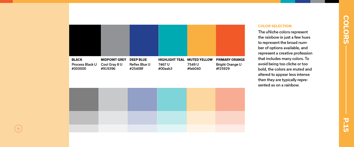
A palette with a rainbow of colors represents the many choices that freelancers get to make.

Photography
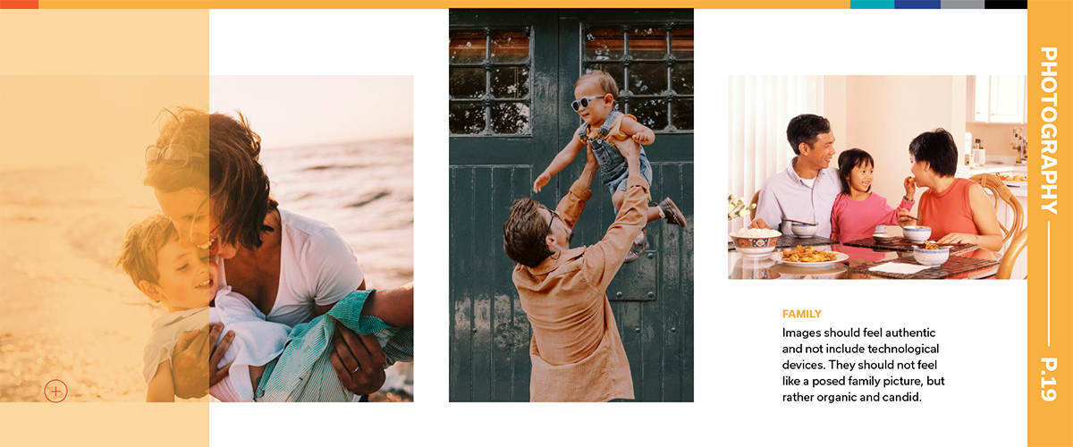
Photography filters and layouts are meant to suggest that financial decisions can be just as intuitive as choosing a color for a creative freelancer.

Physical Touchpoints
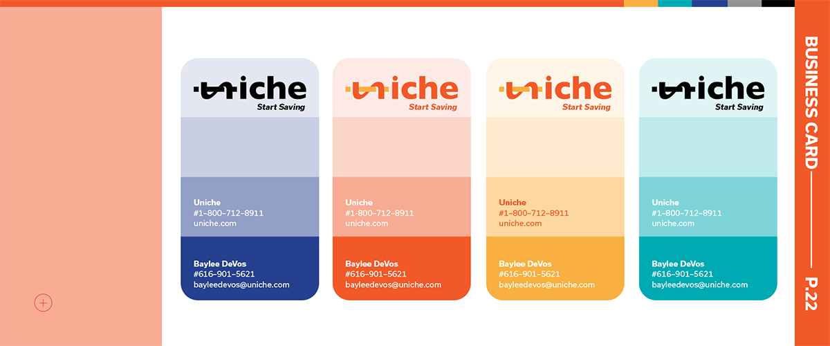
Business Cards
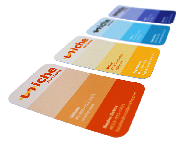
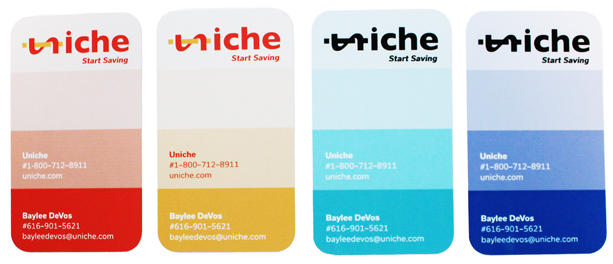
Uniche wants to convey that financial decisions can be just as simple as creative ones with the right teacher. That's why Uniche's buisness cards are made specifically to appeal to creative minds.
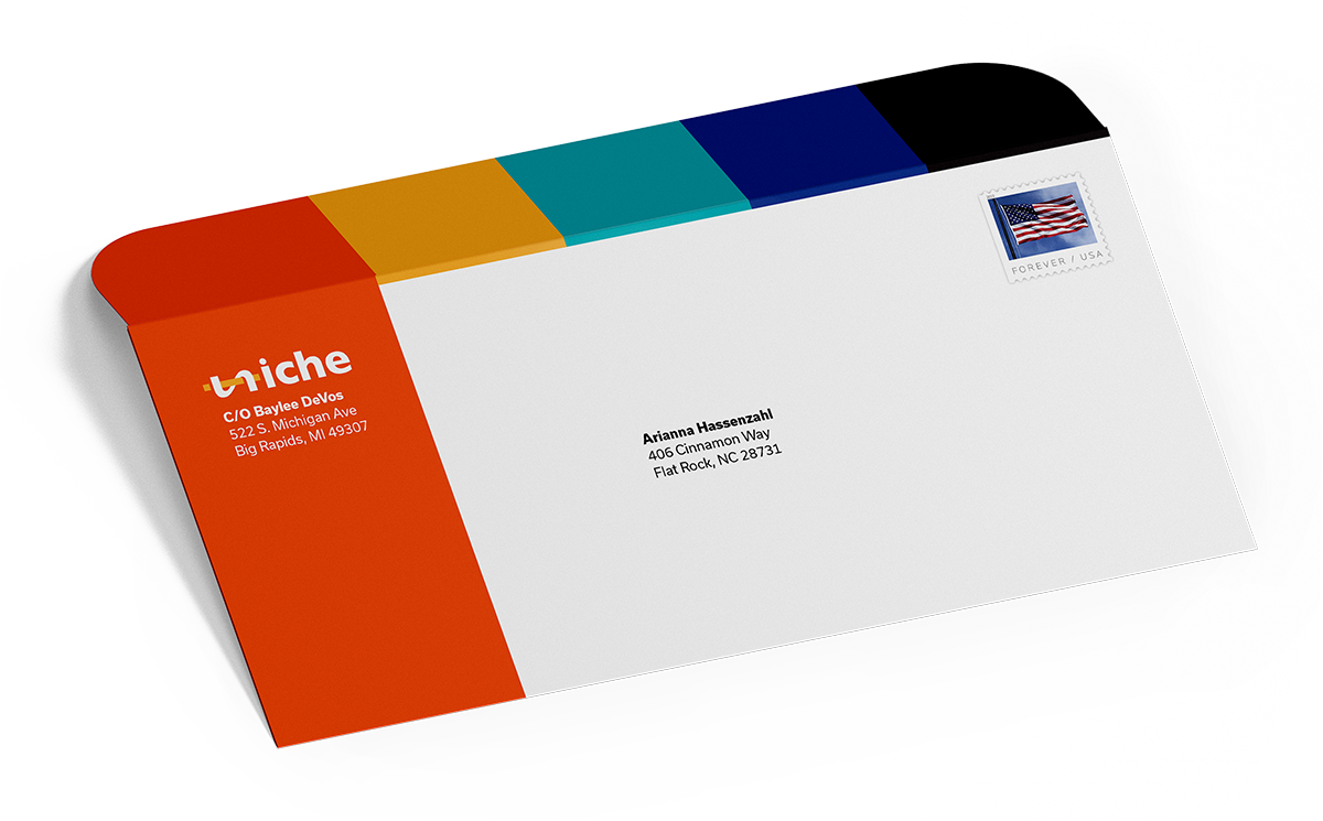
Stationary
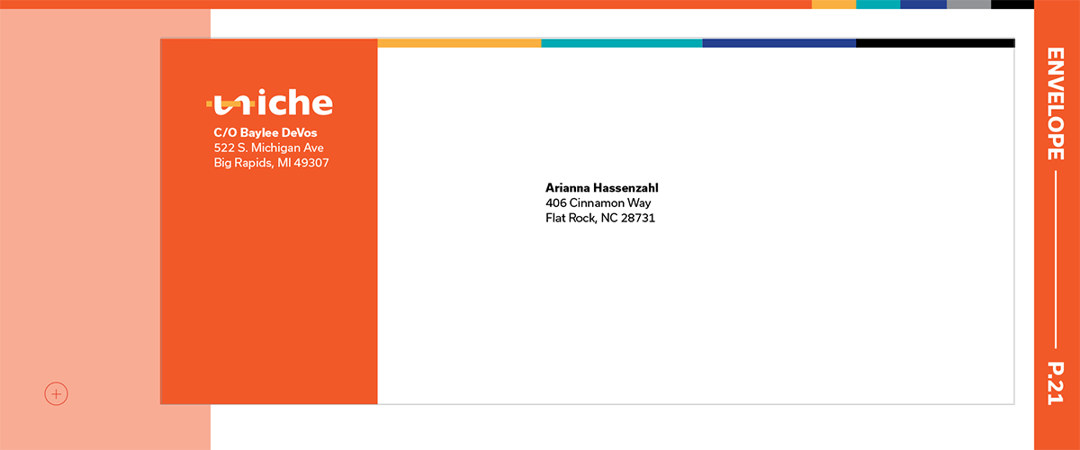
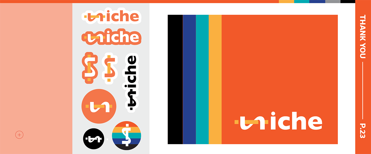
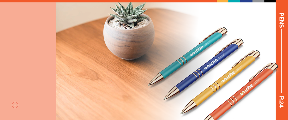
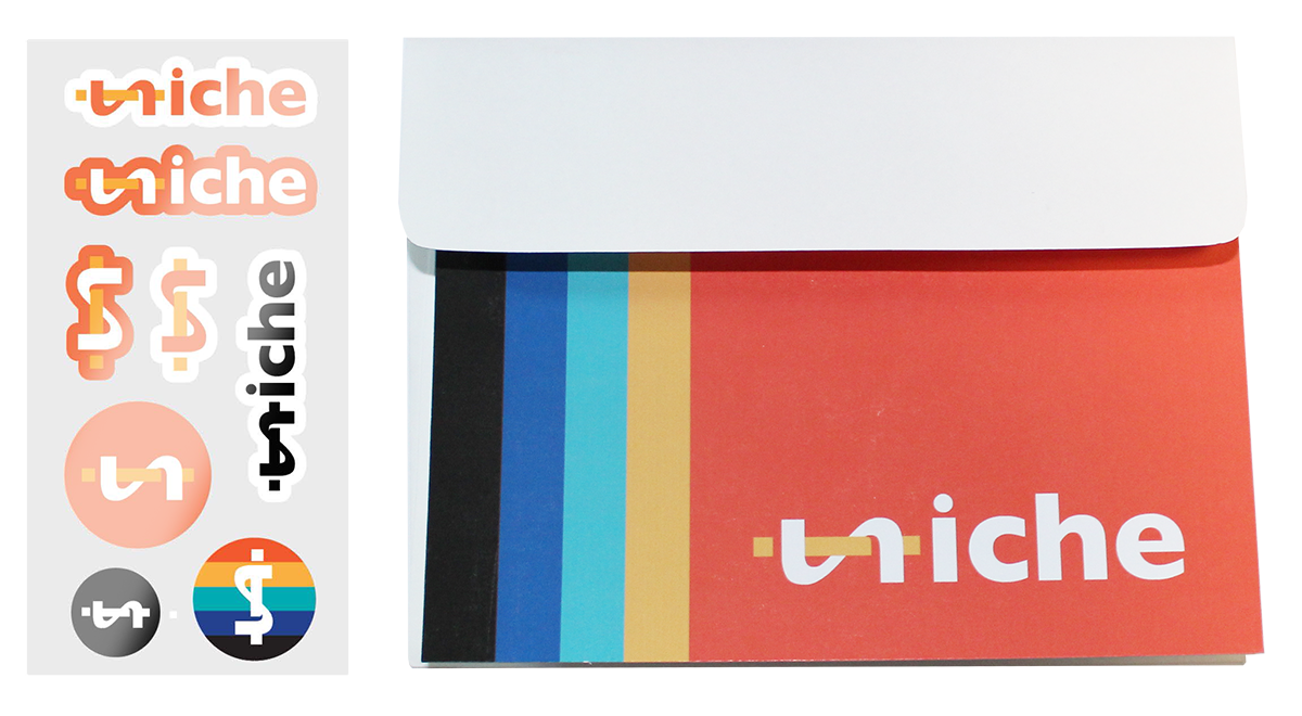
Pens, envelopes, stationary, and labels are all communication tools that Uniche uses to keep in contact with their clients.

Brand Guide
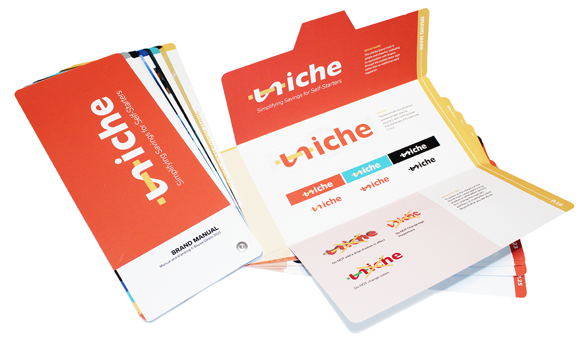
To keep the Uniche brand consistent, I designed and physically crafted a unique brand guide. See the design process and full guide below.

Creating the Brand Guide

“I make design choices every day, but those make sense to me. There's so many financial options that it's confusing.”
Gina Roesenthall, Interior Decorator
User Testing
I began my process by asking numerous non-designers to handle blank sheets of paper and tell me where they would expect the cover to be, and how they would flip through it.
For the fold out panels contained within, I mocked some up out of scrap paper to test the functionality. I also printed out test paper in different sizes to determine what would be small enough to handle, but big enough to hold the needed information.


The Result
My end result was a fold out book that demonstrates the Uniche brand similarly to a Pantone color swatch book. The physical fold outs and printed samples of envelopes, stationary, business cards, and labels make it more engaging and understandable.


Digital Brand Guide
Scroll to experience the digital brand guide.


