Orion Banking
The Problem
The Board members of the Orion Bank in Big Rapids has determined that user experience design can be the primary differentiating factor from their competitors. They are looking for a full user experience, spanning from their app to lobby to giveaways.
Values
Trust and Knowledge:
Banks need to have a visual identity that feels safe.
Ethics and Responsibility:
Banks have a responsibility to treat customer's assets responsibly.
Clarity and Delight:
Banking apps and experiences contain a lot of foreign data, so its important to keep it light and engaging.
Studying Bank Users
Methods
- Body-storming (visited a bank and observed transactions and account changes)
- Personal interviews
- Secondary (online) research
- 5 Es research method
- Conceptual diagramming
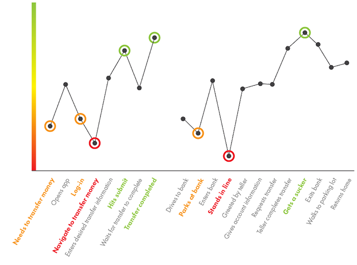
- Journey mapping (see below)
Insights
- Simplicity is important.
- Users want to be treated as individuals.
- The way to a customer's heart is through their community.
Complex information must be made intuitive.
Everyone uses apps for different things.
Community engagement is critical to perception.
Building a Brand
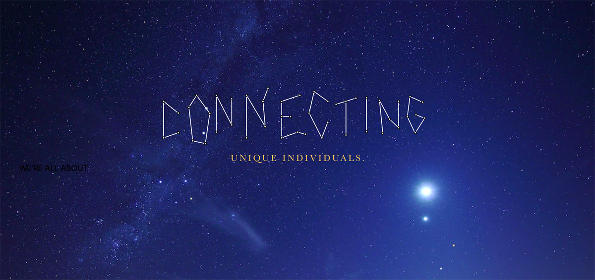
In a constellation, smaller stars come togther to form something greator.
Branding
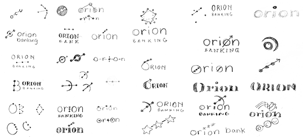
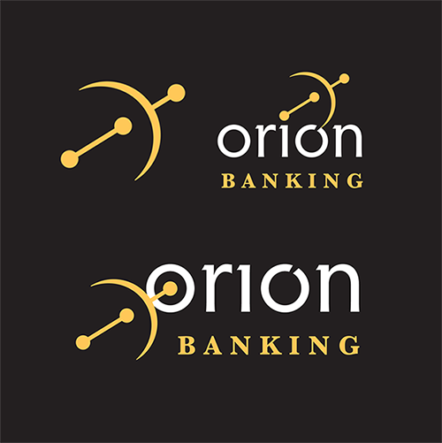
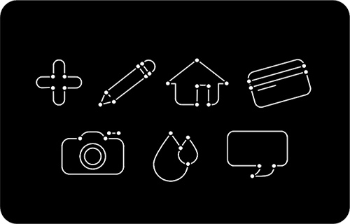
Branding elements include nods to the Orion constellation, a calming split-triadic color scheme, and a type strategy with both freshness and credibility.

More than half of users only interact with their bank through the app.
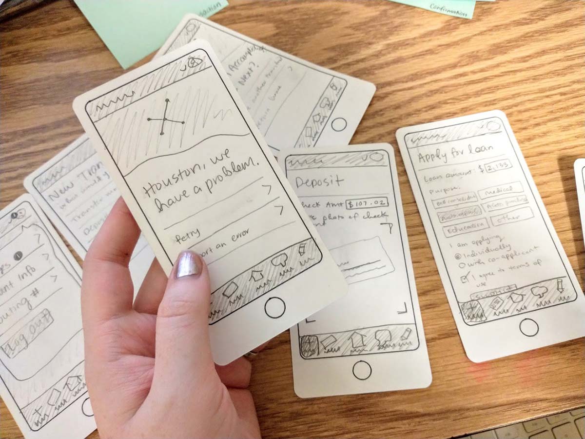
Using paper copies of the screens, I led users through the experience of using the app. This helped me refine navigation to be intuitive and contain all the necessary components, while remaining simple.
Home Screen
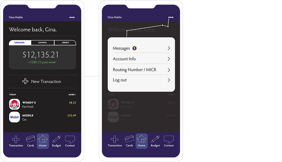

"In my banking app, I'm confused why budgeting is located in transactions. I think it should have its own category.”
Food industry worker, age 32
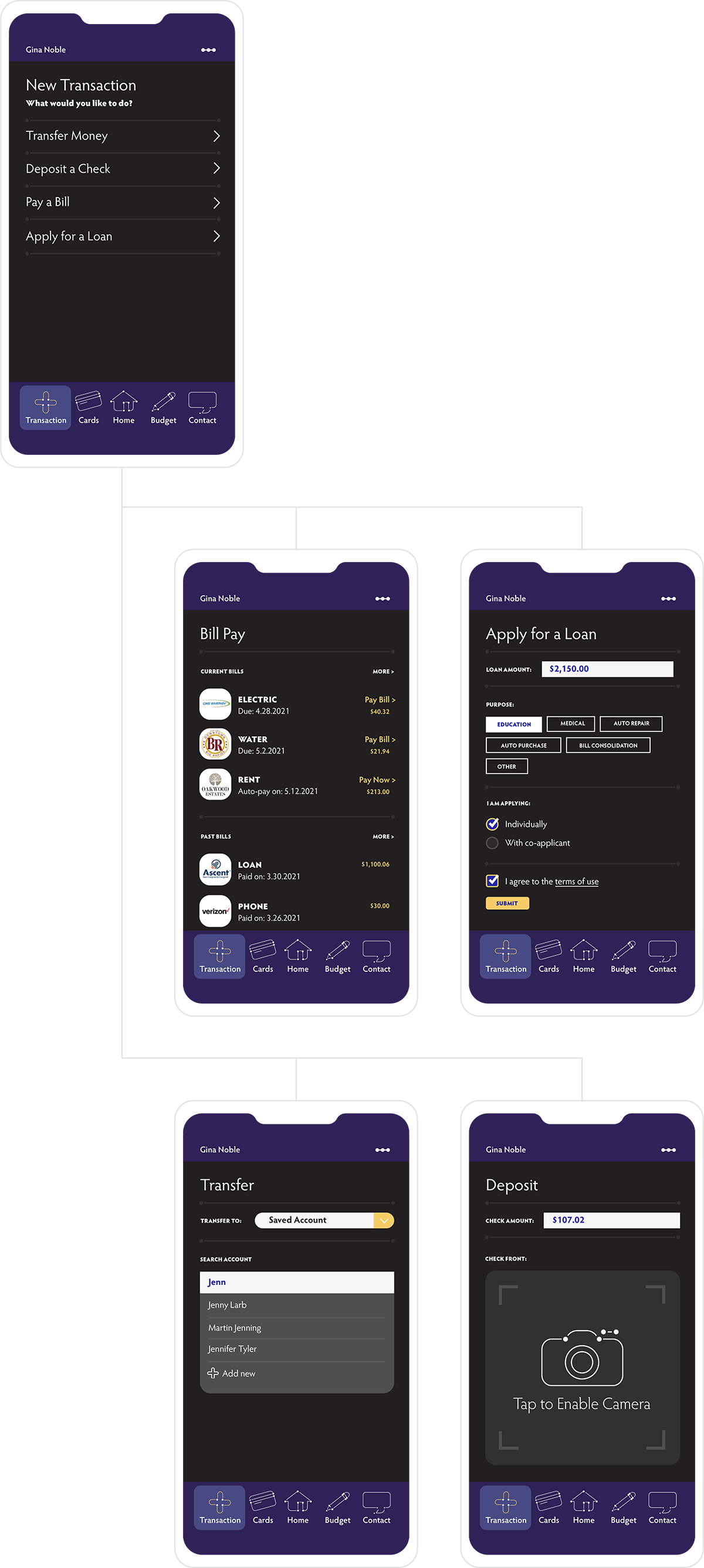
Transactions
Research subjects overwhelmingly agreed that their banking apps had a confusingly large amount of icons and menus. "Transactions" allowed several functions to be intuitively grouped.
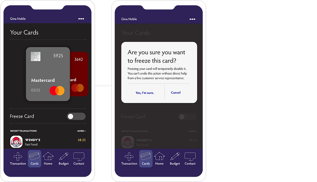
Cards
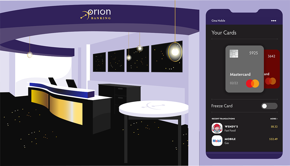
In testing, users identified items faster when they were visualized than when they were typed out. By creating a visual of the card instead of just typing out the basic information, users identify their accounts quicker.

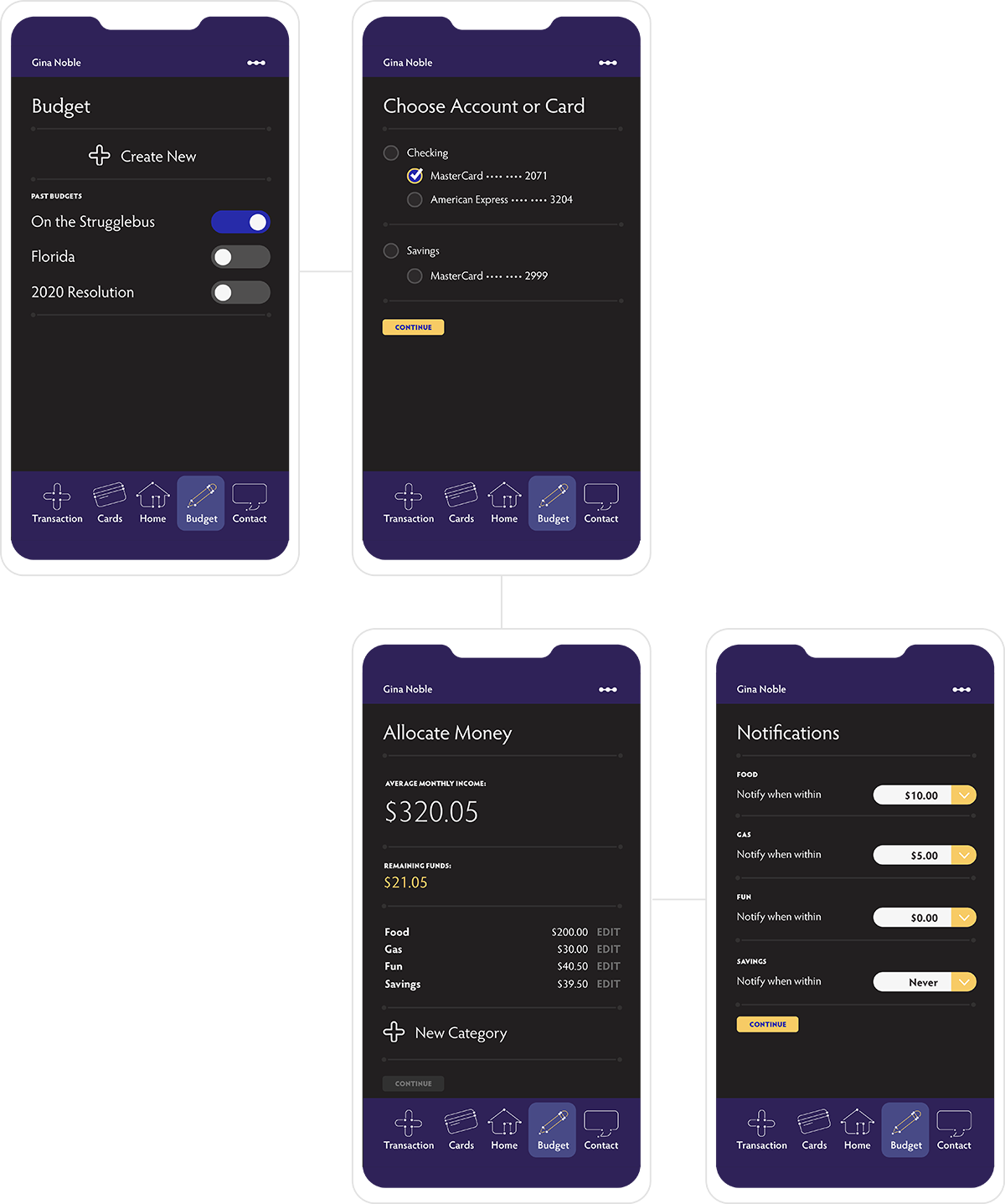
“I feel like I probably should start a budget, but it seems kind of intimidating. I'm not really an Excel spreadsheet type of person.”
College student, age 23
An easy in-app three step budgeting plan helps students keep track of their finances with minimal effort.
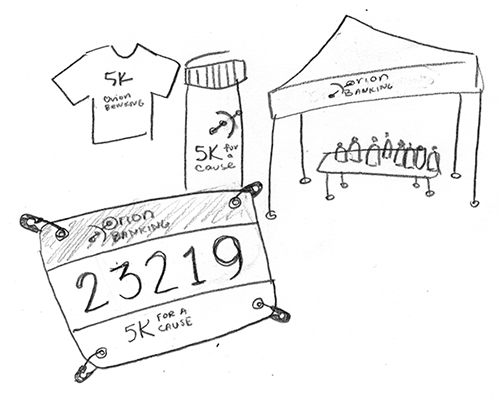
Physical touchpoints are critical to a community centered bank.
Coummunity
Older community members are looking for a bank that is involved in the community. Sponsoring local events and charity activities meshes well with the demographic and caters to the branding concept of "individual but connected.

Social Media
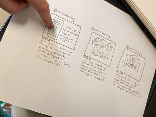
Younger community members want effective digital resources. Low-fi sketches were tested to determine the most effective advertising strategy. My test users determined that advertising the demonstrates the effectiveness of the app are most effective.
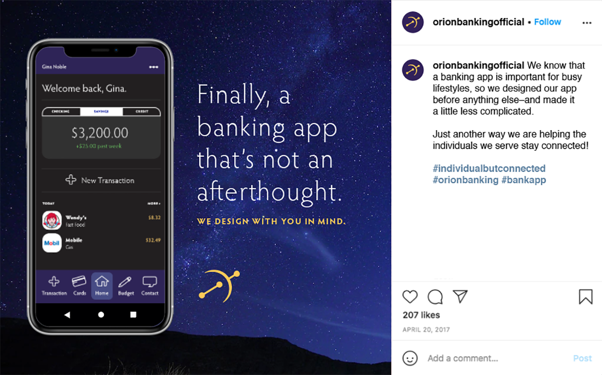

"I use my banking app a lot and I don't really like it. If I saw something better, I might think about switching just because it's a pain for me right now."
College student, age 21
In-Bank Experience
Beyond the walls and signage of the bank, customers interact with staff that is dressed in bank-standard friendly apparel, and are given bank specific thank you candy to round out their experience and keep them coming back for more.

Lobby
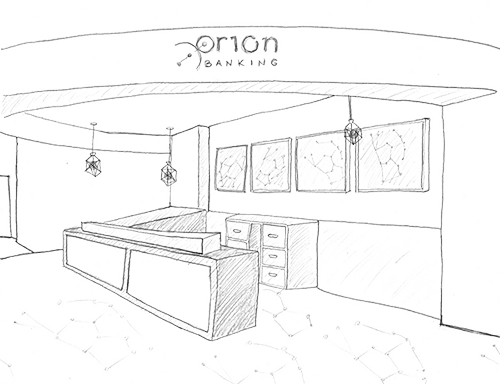
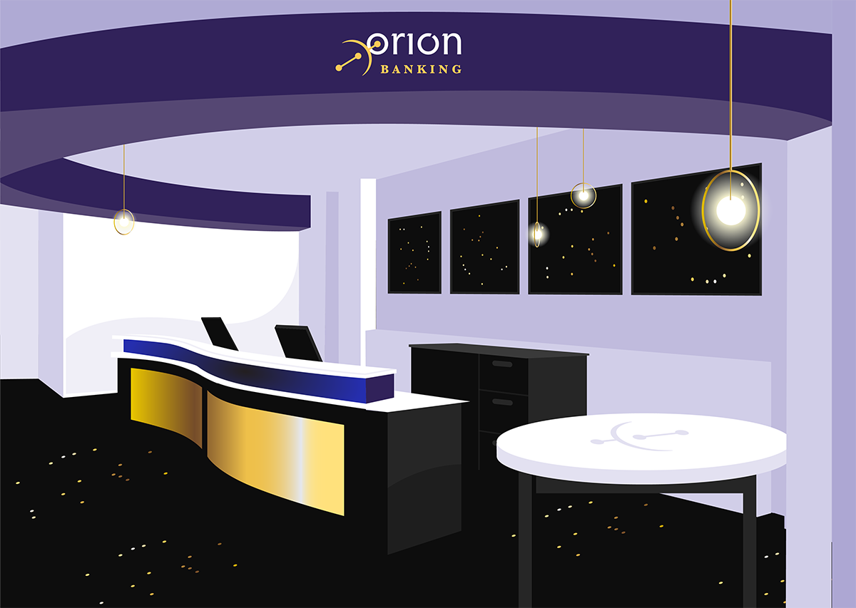
The Orion Banking lobby incorporates Orion banks brand patterns, logo, color scheme, and other details into subtle details. This includes wall hangings, carpeting, lighting, and ceiling structure.
