

CAPE
The Client
The Collaboration for the Advancement of Pharmacy Enterprises (CAPE) is a branch of the Ferris State College of Pharmacy that provides pharmacies with Medication Therapy Management and top tier data collection and analysis in exchange for real world student experience.
Values
Innovation:
Using creativity to bring actionable improvement to pharmacy.
Enrichment:
Improving conversation between members of the pharmaceutical community.
Optimization:
Improving the collection and interpretation of data.
Structure
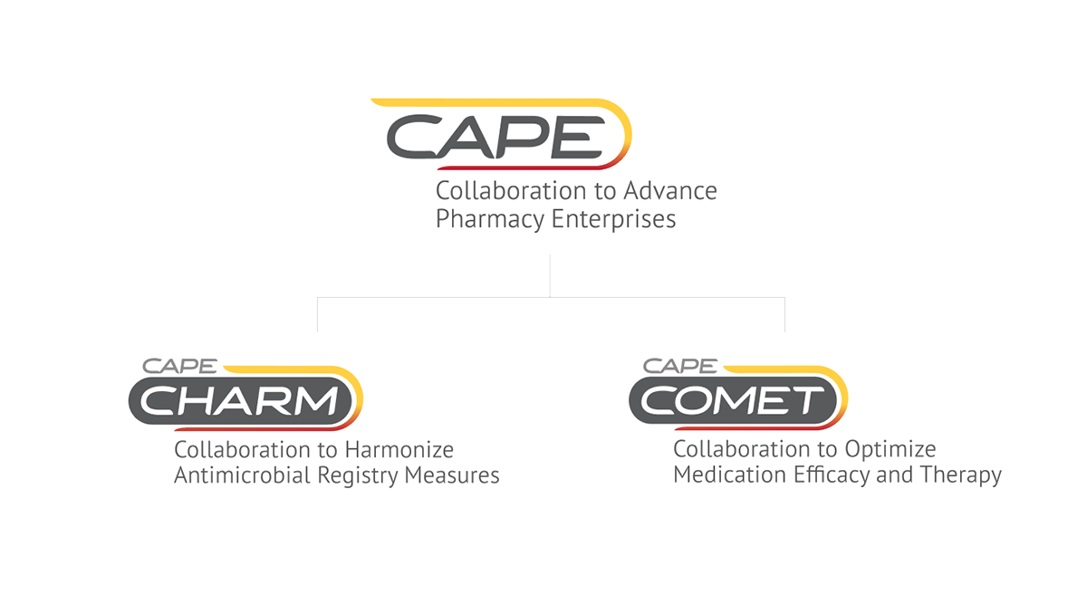
CAPE is an umbrella entity that groups two distinct services: Medication Therapy Management (MTM) and data collection and analysis (CHARM).

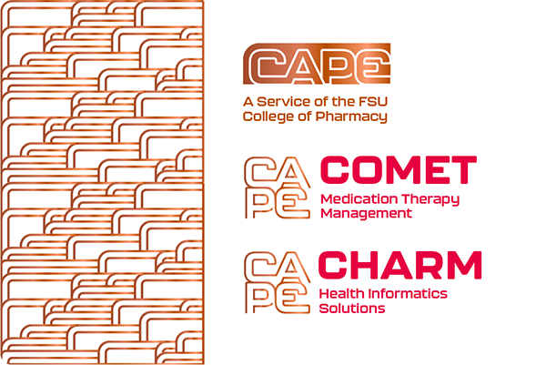
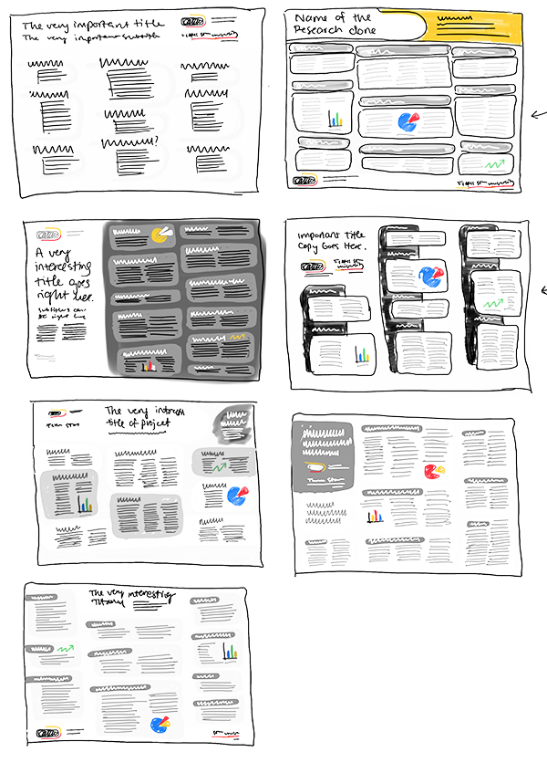
Brand Architecture
Since this structure is unique, our brand system needed to have distinct but related marks that demonstrate brand hierarchy. I created sketches to visually explain this to the client.


Renaming
The name "MTM" did not originally fit in with "CAPE" and "CHARM", so I championed an effort to create a new acronym. "COMET" was accepted and adopted.

Understanding the Users
Three distinct user types currently interact with CAPE.

Student
"My real world experience with CAPE means I'm more likely to land a good position when I graduate."

College of Pharmacy Faculty
"I want to give my students an understanding of how the real world of pharmacy functions, and show them that pharmacists can be innvoative.

Pharmacist
"It's amazing that I get a personalized dashboard for my pharmacy from CAPE, and it doesn't cost me a penny."
Building the Brand
Concepting
It took a lot of sketching to uncover the best solutions.

Digital Process
Digitizing the sketches in black and white brought new life and exploration of typefaces.

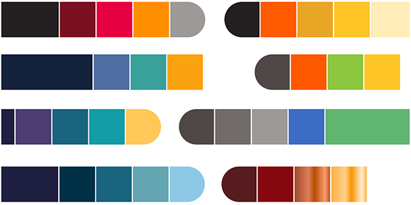
Exploring Color Palettes
Traditionally, pharmacy color palettes contain a lot of blues and oranges. I experimented with a broad range of options for my proposal.


My Proposal
Each member of our team created a unique brand mark proposal with a logo, color palette, pattern, and mockups to present to the CAPE team. This was mine.
Pattern
The pattern can be used thick, or thinned out for a lighter touch. The concept centers around the connections between faculty, students, and the pharmaceutical community, and perpetual forward motion.

Type & Color Strategy
The typeface I used was Kallisto, primarily in the medium and heavy weights.

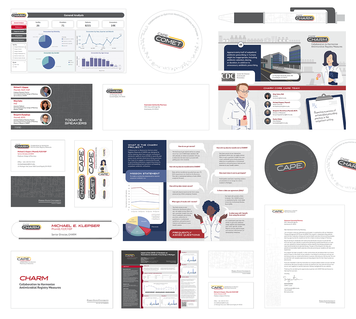
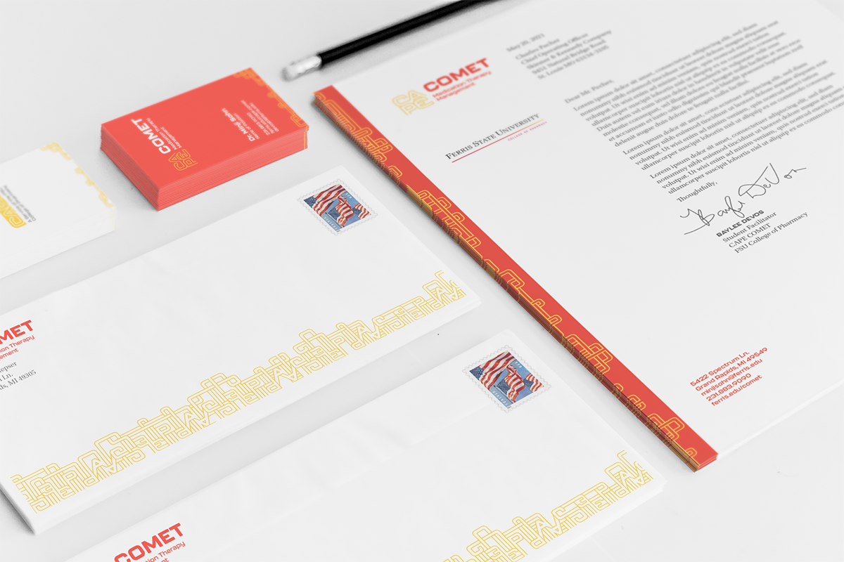
Touchpoints
I created several mockups of touchpoints to demonstrate how the brand could be applied.


Collaborative Branding
The CAPE team decided to use my classmate Mackenzie Brisbin's logo direction, but to refine it further and create a pattern that was similar to mine.
Type Strategy
The typefaces we used were Halogen and PT Sans Pro.

Color Strategy
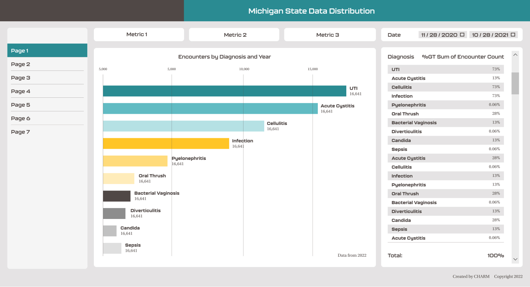
The numerous charts and grafts required that we make use of a primary and secondary color palette.

Pattern

Touchpoint Overview
My teammates and I designed many touchpoints to bring the brand to life.
My Contributions
The touchpoints I was uniquely responsible for include the Coasters, Stickers, Wall Signage, Brochure, Research Poster, and Donor Board.
The Coasters

Wall Signage

Stickers
4"x6" sticker sheets designed to be used at conferences.


The Brochure
Process

Final Result


The Research Poster
CAPE Pharmacists publish their research in giant 49" x 36" posters. I couldn't control the amount of content, but I could create a template with style standards.
Process
Tile printing
Throughout the process I tile printed four posters to assess type, color, and pattern at full scale.


Digital Directions

Final Result

Donor Board
Concepting

Digital Prototypes
I created and refined several directions to present to the CAPE team.
